Scenario
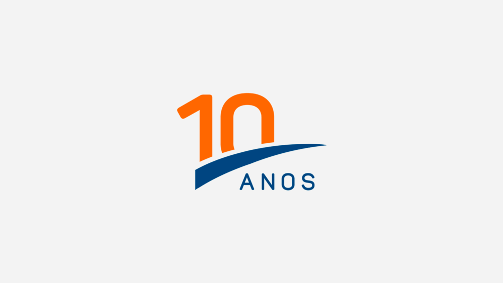
With over 10 years of experience in the market, ValorUp is a reference in specialized services in the areas of auditing, BPO (outsourcing), tax, corporate, financial and business consulting. More than celebrating this history, it was necessary to renew it.
Challenge
How to stay relevant, expanded and renewing your client portfolio, without losing credibility? Upon completing 10 years, ValorUp realized that it was necessary to update its brand and show its relevance to the marked, standing out from competitors and highlighting its value to customers businesses.
Idea
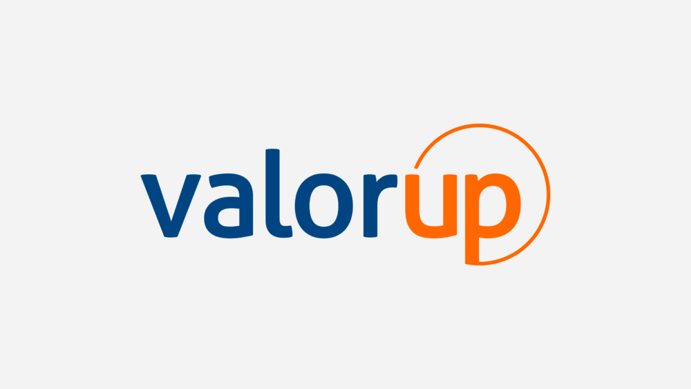
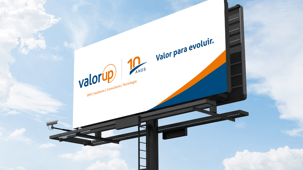
We created the new logo and developed the 10-year seal. The logo uses the color blue, which represents seriousness, solidity, reliability and commitment. The orange color inspires attitude and agility in the processes, being used in "Up". Completing the logo, the circle is a symbol of stability and collaboration, referring to modernity and continuity.
The birth of the brand:
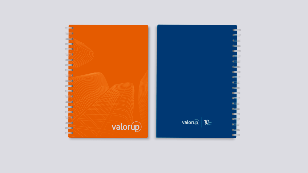
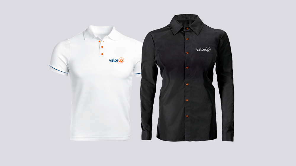
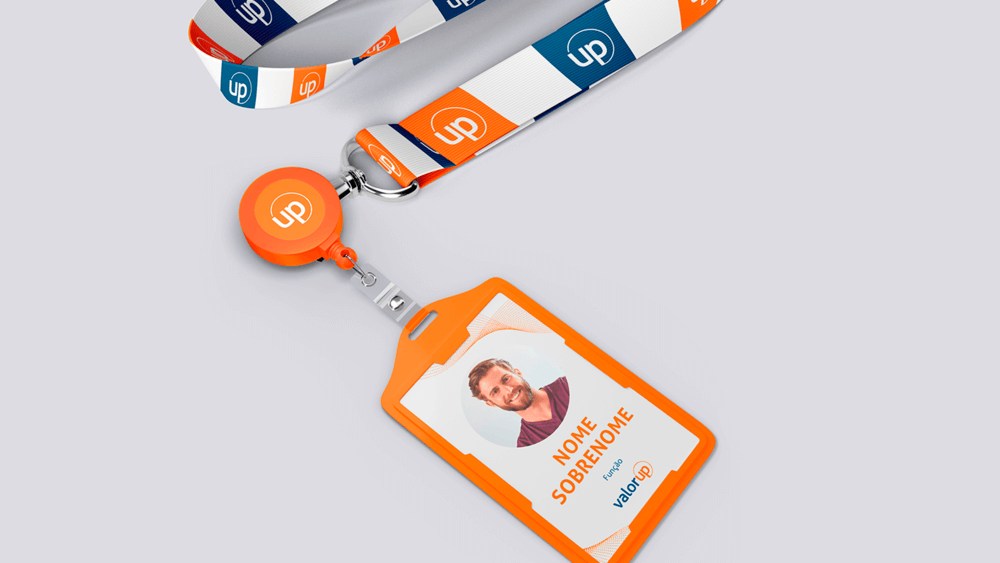
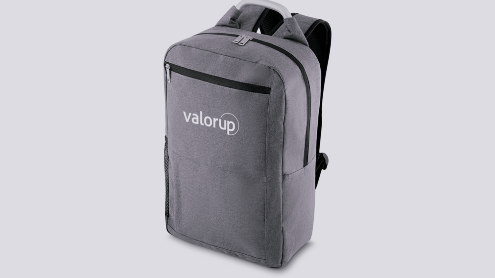
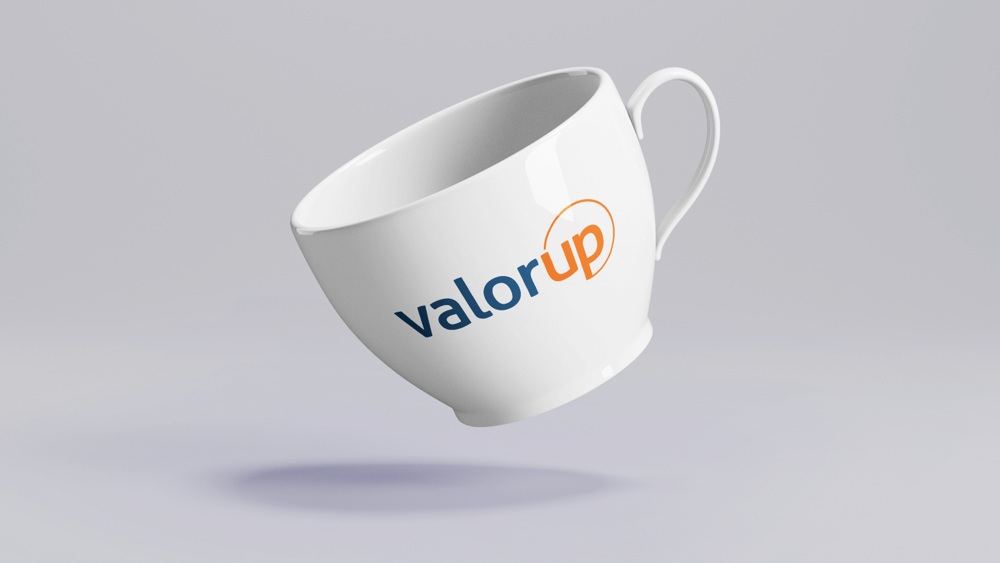
Applications